
- About TCB
- Sewing Machines for TCB
- TCB Crews Introduction
- News / Daily
- Shop / Stockists
- Repair & Hem
- Recruit
- Contact


2026/07/11
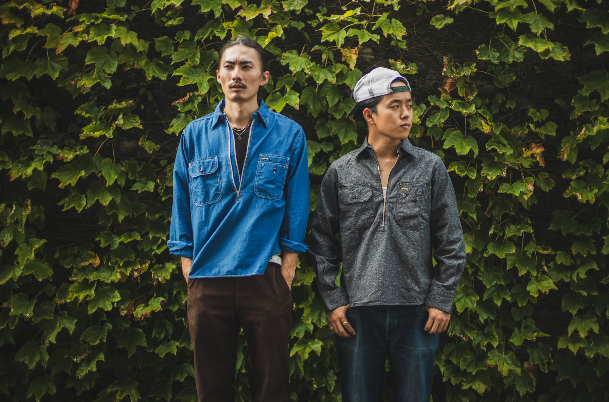
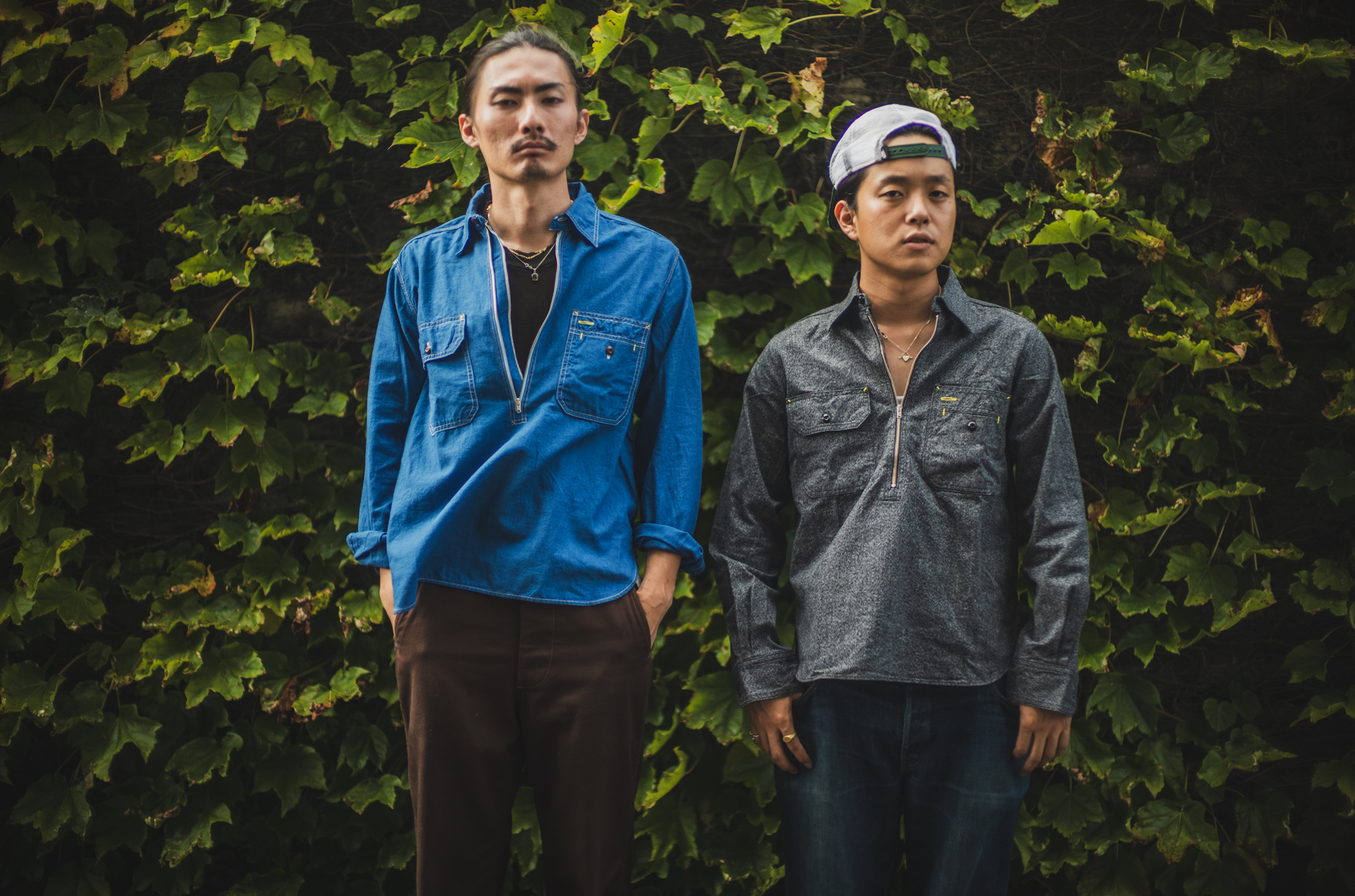
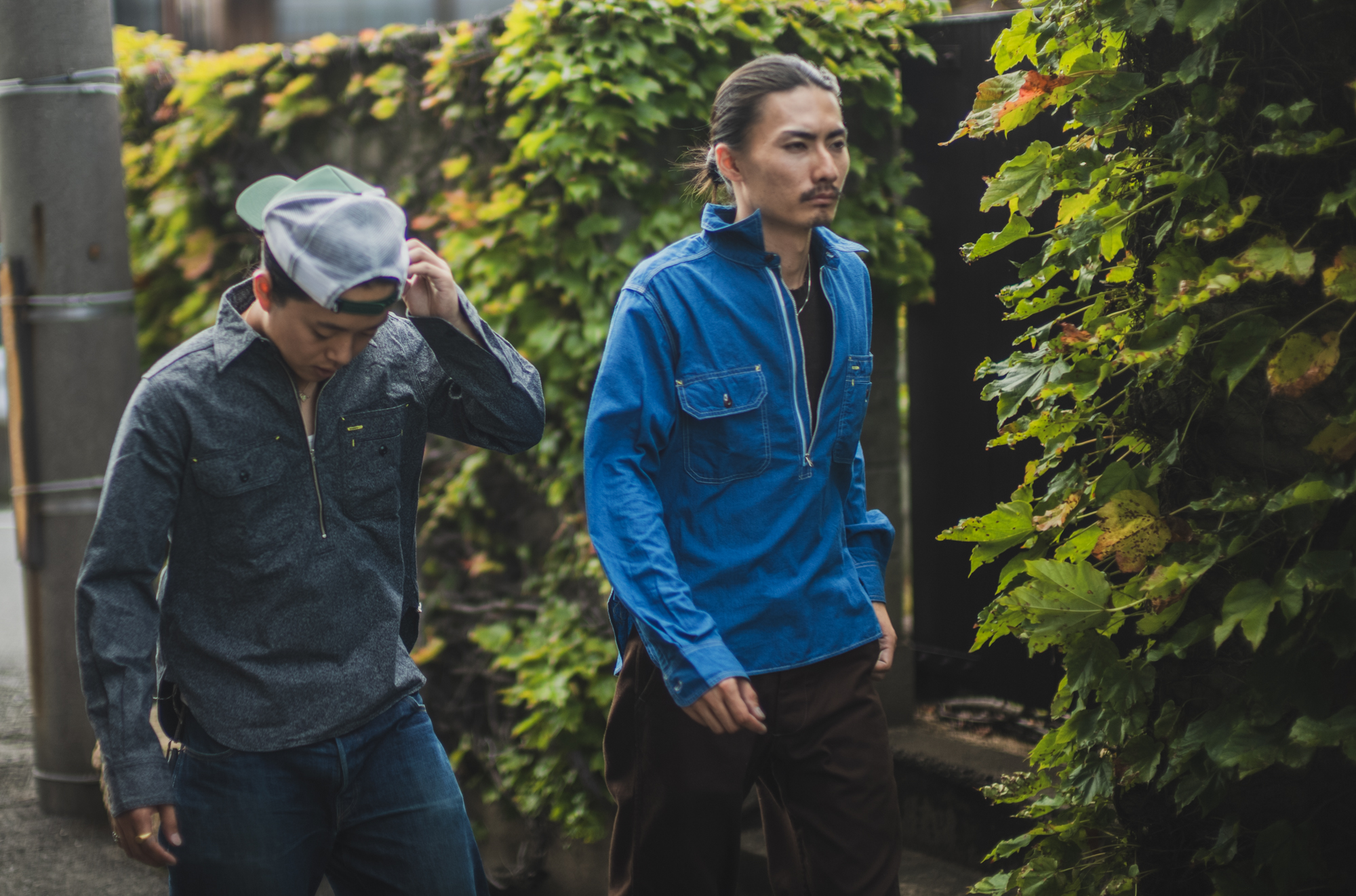
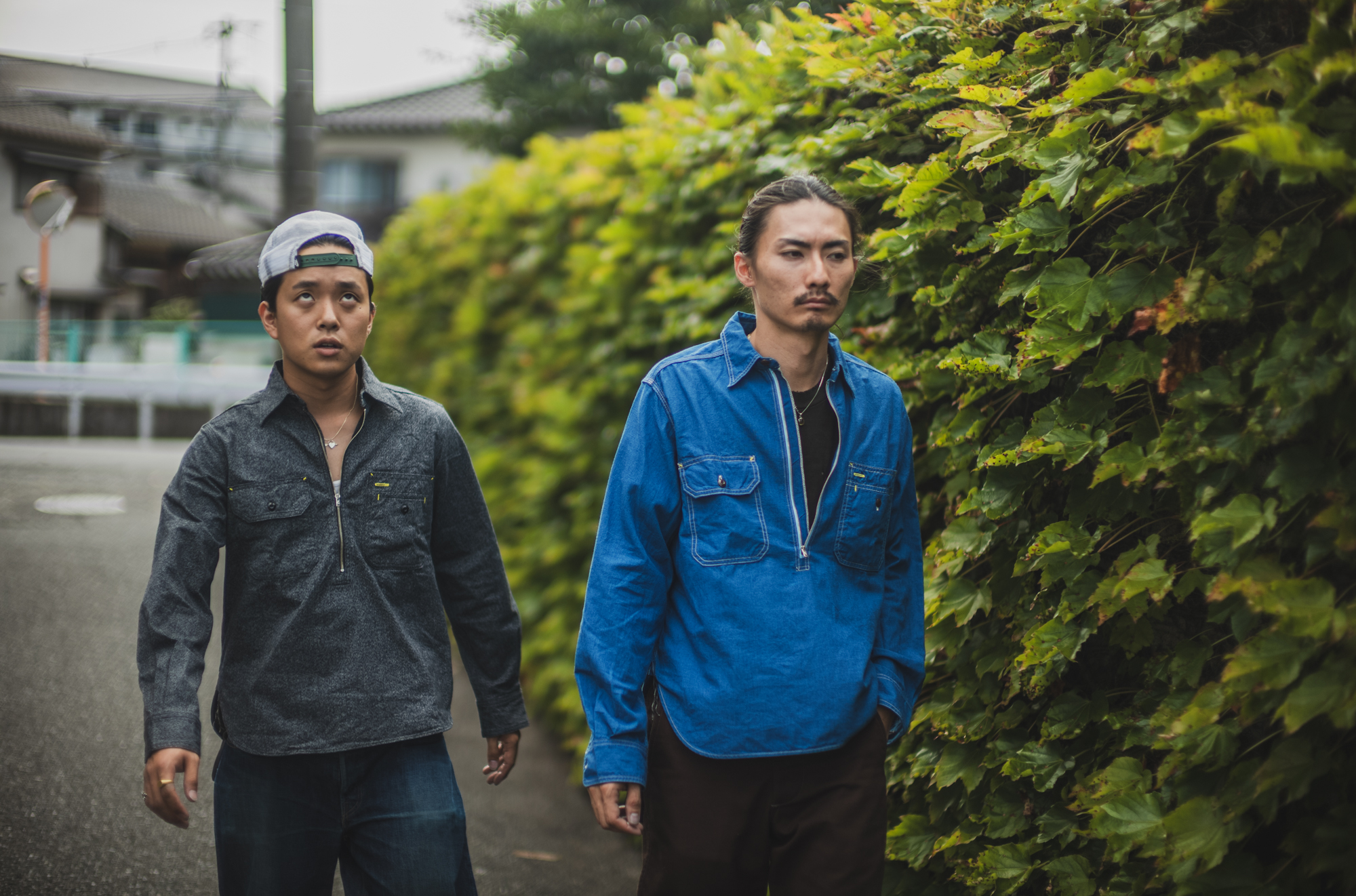
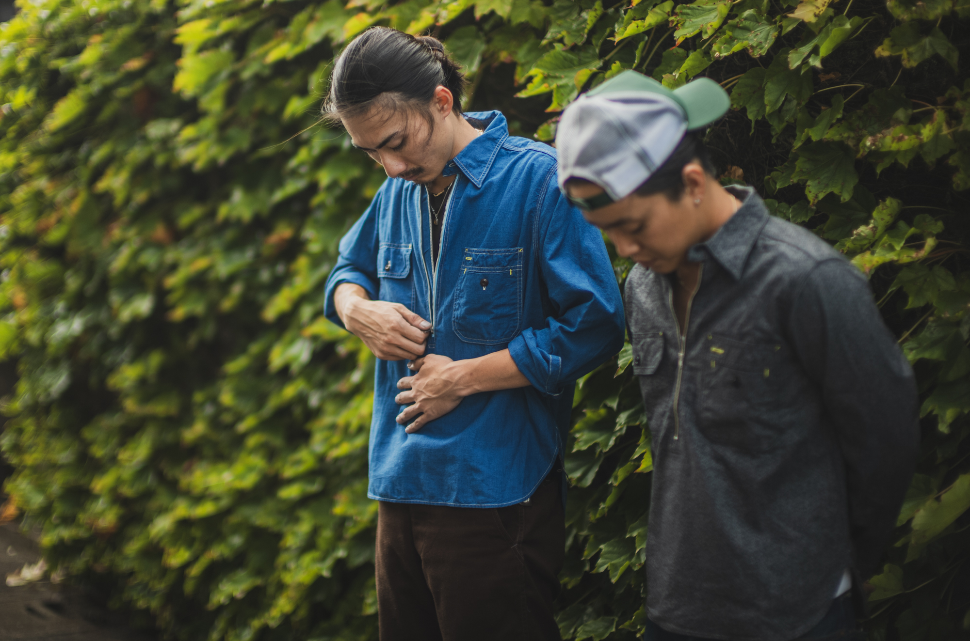
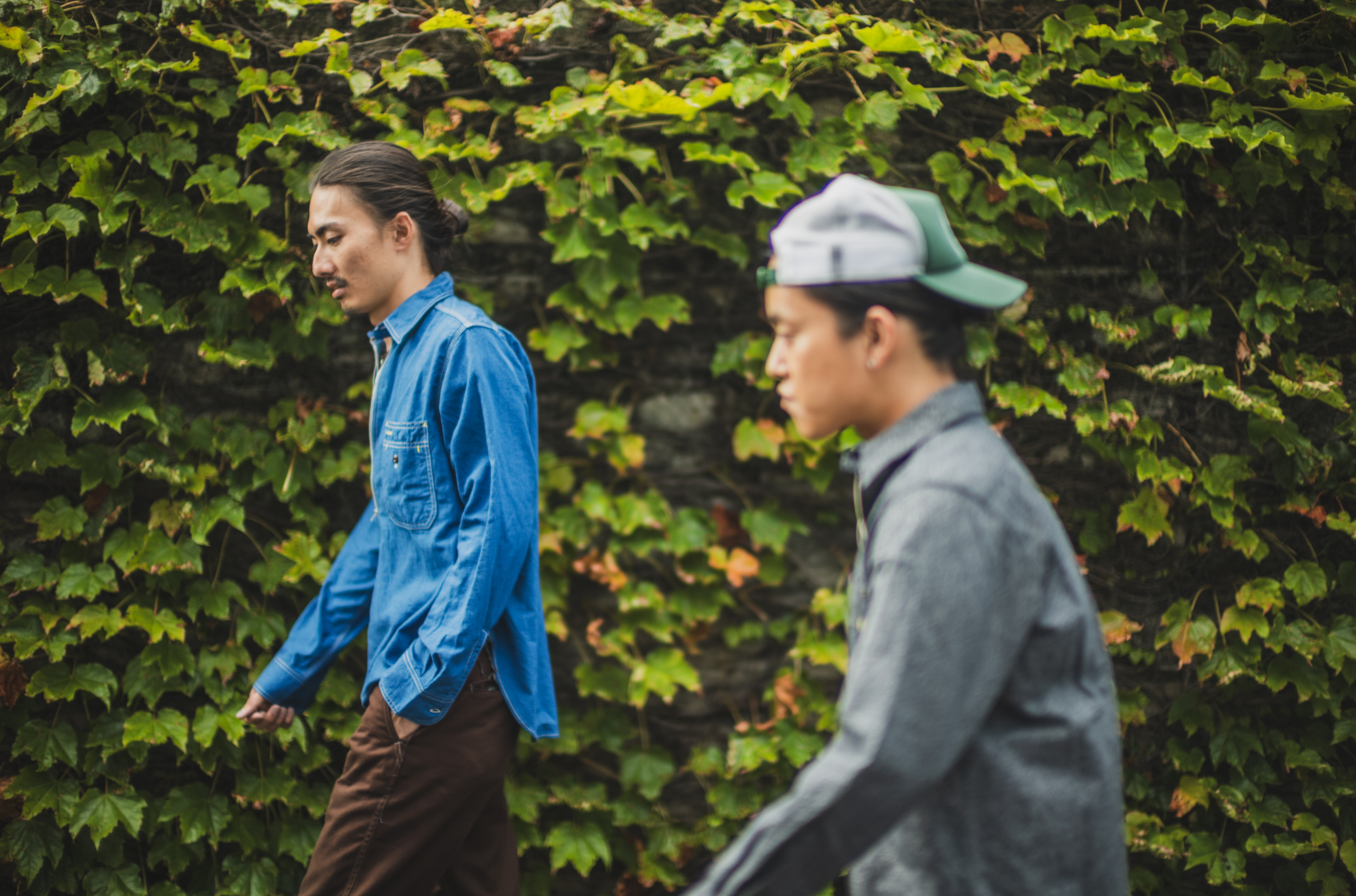
1940’sのUNCLE SAMのVintage Shirtを再現しました。
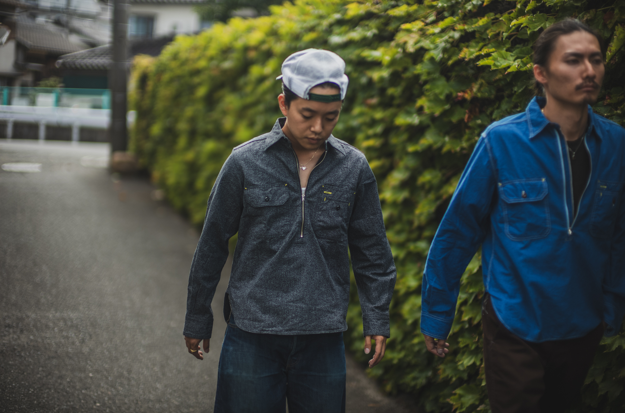
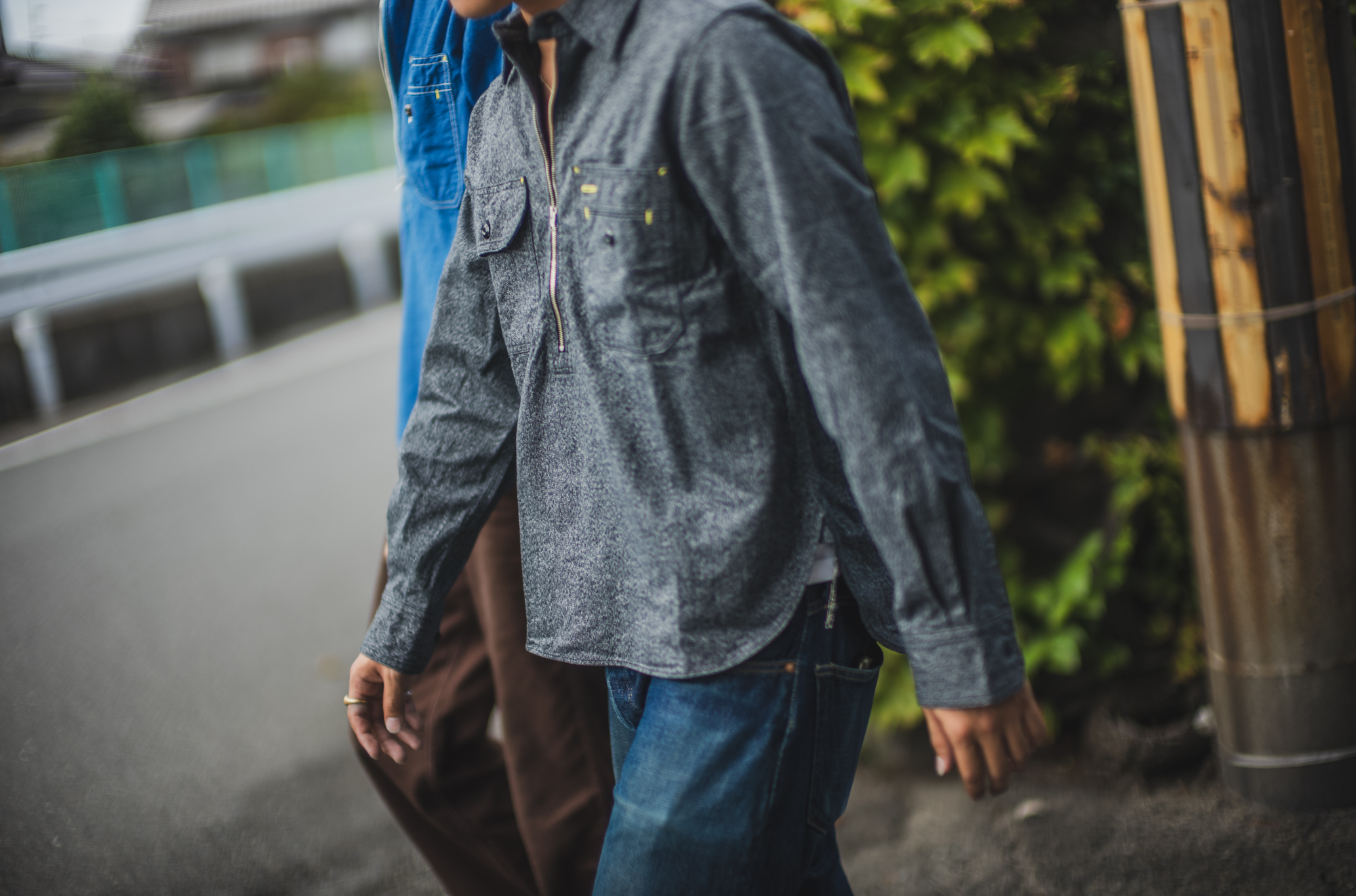
通称ガチャポケと呼ばれる左右非対称の胸ポケット。
左胸には、私も大好きなE-Z REACH POCKETが付きます。
1937年にパテントを取得したこの仕様。
ポケットの上に、もう一つポケットを重ねた二階建ての構造です。
もちろん収納力を増やすためでもありますが、当時まだフィルムで包装されていなかったタバコを、身体の汗や湿気から守るという目的があったそうです。
今見るとデザインに見える。
でも、当時はちゃんと理由がある。
こういう所がVintageのワークウェアの面白さだと思います。
ペン差し部分にはシャツボタンホール。
そして豆カン部分に打たれた、アイキャッチーな赤いバータック。
TCBでは、ここをあえてイエローにしました。
普段、TCBではあまりワークシャツを作りません。
だから、どうせ作るなら。
今回選んだのはハーフジップタイプです。
VintageにはTALONのファスナーが使われていましたが、現代の洋服として強度や安定性を考えると、少し怖い部分もありました。
そこでTCBではWaldesを採用しています。
そして面白いのが、ファスナーの下止め。
一般的にはボックス型が多いのですが、今回参考にしたVintageには、通称「パンツ止め」と呼ばれる、本当に下着のような形をした下止めが使われていました。
それが妙に気に入ってしまい、TCBでもパンツ型の下止めを採用しました。
Vintageは着丈がかなり長めです。
TCBでは、タックインしようと思えばできる。
でも、裾を出して着てもバランスが取れる。
そんな着丈とサイズ感にモディファイしています。
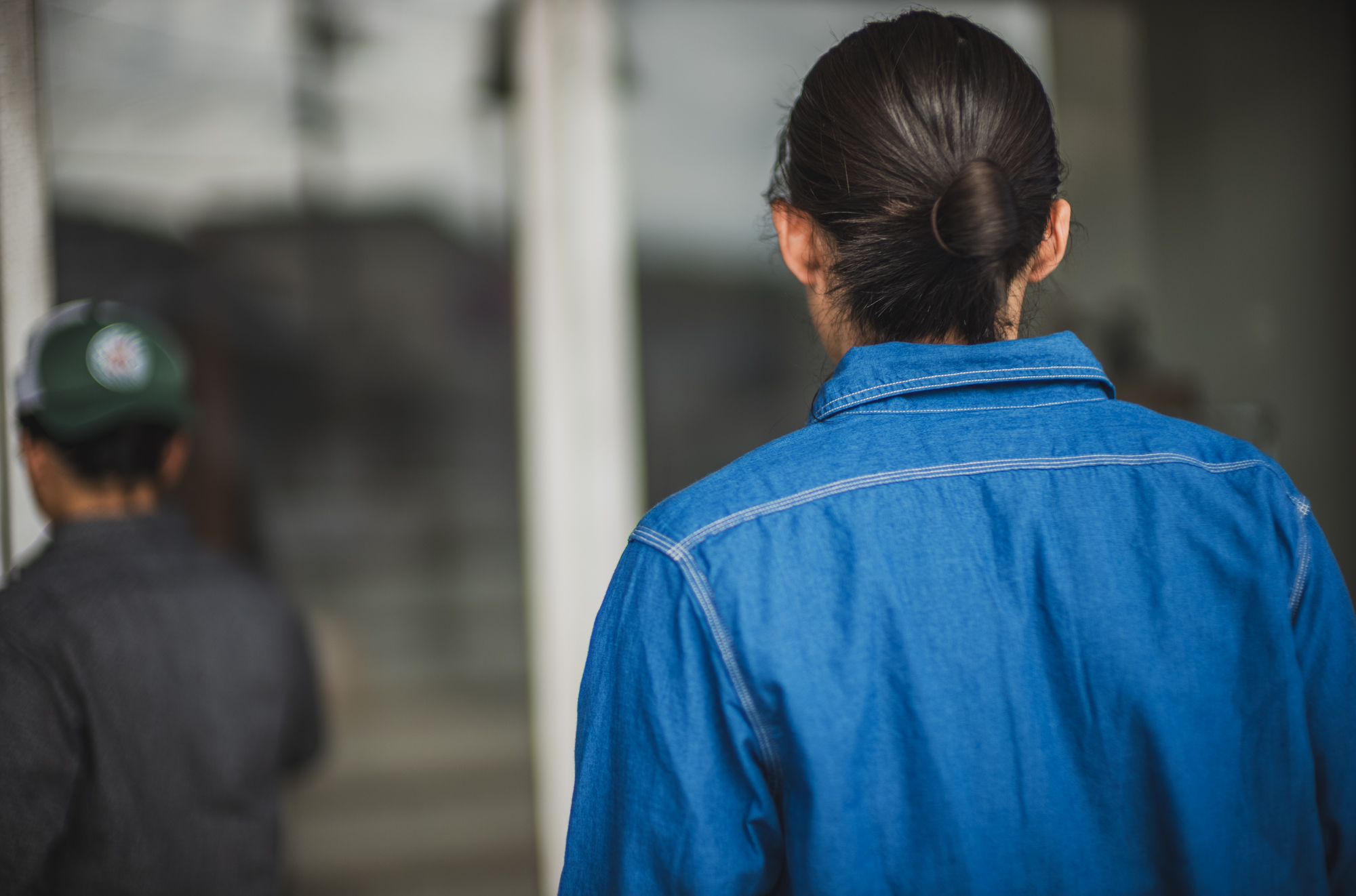
そして、もう一つ見てほしいのが縫製の下糸。
Vintageのカバーオールなどでも時々見かけますが、トリプルステッチの巻き縫い、そのチェーンステッチの下糸やポケットの下糸に、色とりどりの糸が使われていることがあります。
TCBでも適当に色とりどりの糸を使うことも考えました。
でも今回は、Vintageの「適当に見える糸使い」を、一つ一つ拾いました。
ここはこの色。
次はこの色。
参考にしたVintageと同じ色使いで縫製しています。
是非、手に取った際にはシャツをひっくり返して確認してみてください。
そして。
ハーフジップのワークシャツと聞くと、私には思い出すエピソードがあります。
二十数年前。
ヤフオクで、私が某ブランドのハーフジップワークシャツを出品しました。
当時のヤフオクは、落札されたら相手の個人情報が公開され、後は当人同士にお任せというスタイル。
落札者の住所を確認すると、児島。
めちゃくちゃ近い。
取引が終わって数ヶ月後、なぜか私から急に連絡をして、一緒に食事に行くことになりました。
そこで出逢ったのが、後のWORKERSの舘野さんです。
きっかけはTCBの洋服でも、WORKERSの洋服でもありませんでした。
一枚のハーフジップのワークシャツ。
それが、左右のファスナーが噛み合うように、私たちを出逢わせてくれました。
フルジップではなく、ハーフジップという所も私たちっぽい(笑)
ノッティングヒルの恋人とか、ユー・ガット・メールみたいな出逢い。
……男二人ですが(笑)
これからも、私たちが作る洋服がきっかけで、世界中の誰かと誰かが出逢う。
そんな瞬間が生まれれば嬉しいです。
そんな願いも込めて。
Uncle Cats、発売です。
生地
50年代のVintageに見られる、いわゆるベタシャン。
今回のシャツは、そのVintageのベタシャンを元に、TCBオリジナルで生地から作りました。
インディゴは、経糸20番単糸、緯糸20番単糸。
4.4ozの軽い生地です。
一般的なシャンブレーは、経糸に染め糸、緯糸に白糸を使います。
そのため表面には白が混ざり、霜降りのような軽さが生まれます。
一方で、ベタシャンは緯糸にも染め糸を使います。
白い点が表に出にくく、無地に近い、しっとりと沈んだ表情になるのが特徴です。
ただ、今回作りたかったのは、単に“全部を同じ青で染めた生地”ではありませんでした。
経糸にはロープ染色のインディゴ。
緯糸にはチーズ染色の硫化染料。
さらに、経糸と緯糸でほんの少し濃度差をつけています。
経緯が完全に同じ色に沈んでしまうと、ただの平坦な青になってしまう。
でも少しだけ色の差を残すことで、マットな表情の中に、奥行きのあるブルーが生まれました。
写真で見ると分かりやすいですが、白糸のシャンブレーのような霜降り感ではなく、青の中に青が重なっているような見え方です。
そしてもう一つ、今回大事にしたのが「よこムラ」です。
古いシャンブレーを見ていると、独特の横方向のムラが出ているものがあります。
これは当時の糸の使い分けに理由があるのではないかと考えました。
製織の際、強い張力がかかる経糸には、ある程度均整のとれた強い糸が必要になります。
一方で、緯糸には経糸ほどの張力がかからないため、多少ムラを含んだ甘撚りの糸でも使えたはずです。
その膨らみや不均一さを持った緯糸が、そのまま生地の表情として織り込まれていたのではないか。
特にベタシャンの場合、緯糸にも染め糸を使っているため、着用を重ねると、そのムラの凸部分から少しずつ色が削れていきます。
その結果、横方向のムラがより豊かに浮かび上がってくる。
今回の生地では、その表情を狙いました。
現在は原綿の品質も紡績の精度も高くなっているため、ただ甘撚りにしただけでは、昔のようなムラはなかなか出ません。
そこで緯糸には、細番手ながら強く長いムラ形状を持たせた糸をあえて設計しました。
昔の糸が結果として持っていた不均一さを、今回は意図を持って織り込んでいます。
着込むほどに、縦方向の色落ちと横方向のムラが交差していく。
この生地ならではの経年変化を楽しんでいただけると思います。
ブラックは、Vintageよりもあえてヘビーに作りました。
経糸の黒い部分には、硫化チーズ染色の20番単糸。
生成りに見える部分には、40番双糸を使い、撚り合わせることで杢糸を形成しています。
黒と生成りで糸の太さをあえて変えることで、一本の糸になった時に自然な凹凸が生まれます。
その凹凸が、生地になった時にVintageらしい奥行きとして現れます。
緯糸には、同じく硫化チーズ染色の10番単糸を使用。
さらに高密度に織ることで、9.5ozというしっかりとした厚みに仕上げました。
シャツとしてはもちろん、カバーオールにも使えそうな重量感。
青のベタシャンとはまた違う、黒杢ならではの粗さと重さがあります。
同じベタシャンというテーマでも、インディゴは軽く、青の奥行きを。
ブラックは重く、杢の凹凸を。
どちらも、ただVintageをなぞるのではなく、Vintageを見て感じた違和感や魅力を、今のTCBなりに生地へ落とし込んだものです。
着始めは静かですが、着込むほどに表情が出てくる。
そんな生地に仕上がったと思います。
We have recreated a vintage Uncle Sam shirt from the 1940s.
It features asymmetrical chest pockets, a vintage shirt pocket design commonly called in Japanese Gacha-poke.
The left chest pocket is the E-Z Reach Pocket I personally love. This specific pocket design was patented in 1937. It features a two-tier structure where one pocket is layered over another.
While it certainly increases storage capacity, the design originally served a specific purpose: protecting cigarettes, which weren’t yet wrapped in film packages back then, from body sweat and humidity.
To our eyes, it looks like a stylistic choice. But at the time, there was a practical reason for it. This is exactly what makes vintage workwear so interesting.
□Details
There is a buttonhole specifically for a pen. And there is an eye-catching red bartack at the corners of the chest pockets.
On our repro shirts, we’ve decided to make that bartuck yellow instead to add a bit more cheapskate flair. We don’t usually make work shirts at TCB. So, we figured if we were going to do it, we’d do it right and unique.
We’ve chosen the half-zip style. The vintage shirt originally has a TALON zipper, but considering the durability required for modern clothing, the vintage zipper is not strong enough.So, we’ve opted for a Waldes zipper instead. Another interesting detail is the zipper’s bottom stop.
While the standard is usually a box-shaped stop, the vintage piece we referenced this time has a stop shaped like a pair of briefs
I really liked that quirk, so we’ve adopted the pants-shaped bottom stop for our version as well. Honestly, people working in the clothing hardware companies call this detail briefs-stop, haha.
The vintage original has a very long dress length but we’ve modified the length a bit shorter so it’s up to you if you tuck in or out.
There’s one more detail I want you to notice: the bobbin thread used in the stitching. You sometimes see this detail on vintage chore coats and similar items on triple-stitched seams or pocket stitching but the bobbin threads are in various different colors. I think it was just purely because of the production efficiency. I mean unless you flip it inside out, you don’t see the color of the bobbin thread. Then, why change it?
This kind of so-to-say half-hearted construction can hardly be seen on the clothings of today but it looks cute & vintage-like to our eyes. So, our shirts are made with various different colors of threads used for the bobbin thread.
□Fabric/ Beta-Shan
It’s what is known as beta-shan in Japanese (solid-color chambray), a type of fabric seen in the vintage garments from the 1950s.
For this shirt, we’ve created our own original fabric based on that vintage solid-color chambray. For the indigo version, we used count 20 single yarns for both the warp and the weft.
It is a lightweight 4.4oz fabric. Standard chambray typically uses dyed yarn for the warp and ecru yarn for the weft. This results in white flecks appearing on the surface, creating a light, heathered look.
In contrast, beta-shan uses dyed yarn for the weft as well. This prevents white dots from showing on the surface, resulting in a rich, subdued appearance that looks almost like a solid color. However, what I wanted to create this time wasn’t simply fabric dyed entirely in the same shade of blue.For the warp, we’ve used rope-dyed indigo yarn for the warps and have used cheese dyed & sulfur-dyed yarn for the wefts. Also, we have intentionally made the indigo tinge subtly different between the warp and the weft so that the fabric looks more true to the vintage fabric. If the warp and weft were to blend into the exact same shade, the result would be a flat, uniform blue. By retaining a slight color variation, however, a blue with real depth emerged from within the matte texture.
Another key element we’ve focused on is horizontal unevenness (or yoko-mura).
When looking at vintage chambray fabrics, we often notice a distinctive horizontal irregularity in the weave.We hypothesize that this stemmed from the way yarns were selected and used in the past.
During weaving, the warp is subjected to higher tension, so it requires strong, relatively uniform yarn. On the other hand, the weft isn’t under the same level of tension, so it was possible to use loosely twisted yarns that naturally contained some irregularities. We’ve imagined that the loft and unevenness of those weft yarns were woven directly into the fabric’s character.
With solid-color chambray (beta-shan) specifically, where the weft is also dyed, repeated wear causes the color to gradually abrade from those irregularities.
As a result, the horizontal unevenness becomes more pronounced and rich in character. That is the specific aesthetic I aimed to achieve with this fabric.
Today, the quality of raw cotton and the precision of spinning technology have improved so much that simply using a loose twist won’t easily produce the kind of unevenness seen in the past.
To address this, we’ve intentionally designed a weft yarn that despite being a fine count features strong, elongated irregularities. We have deliberately woven in the kind of unevenness that occurred naturally in vintage yarns. As you wear the garment, the vertical fading and horizontal irregularities will intersect. I hope you enjoy the unique way this fabric ages over time.
□ Fabric/ Black Chambray
For the black version, we’ve intentionally made the fabric heavier than the original vintage shirt. For the black parts of the warp, we used a count-20 single yarn dyed by the sulfur cheese-dyeing process.
For the other parts appearing in an unbleached tone, we used a count-40 two-ply yarn, twisting them together to create a moku (heathered/marled) effect.By intentionally varying the thickness of the black and natural yarns, a natural unevenness emerges when they are combined into a single thread. This unevenness manifests as a sense of vintage fabric. For the weft, we used a No. 10 single yarn, also sulfur cheese-dyed.
By weaving it at a high density, we’ve achieved a substantial weight of 9.5 oz. It has enough thickness to serve not just as a shirt, but also as a fabric for a chore coat. It possesses a ruggedness and weight unique to black moku distinct from the character of beta-shan. While sharing the same solid chambray theme, the indigo version offers lightness and depth of blue, whereas the black version offers weight and the textured unevenness of the moku blend.In both cases, rather than simply imitating vintage styles, we have translated the nuances and appeal we perceived in vintage garments into a fabric that reflects TCB’s own modern interpretation. It starts with a quiet appearance, but develops a rich character the more you wear. That is the kind of fabric we believe we have created.



 Categolies
 Tag
Tag Archive